We turned a natural character into an energetic, fresh brand world.
Sector: Food, E-commerce
Scope: Branding & Logo, Packaging Design, UX/UI Design, E-commerce Interface
Format: 12” LP • 33⅓ RPM • Stereo
Matrix: PKP-016-A / PKP-016-B
Made in Türkiye • ℗ & © Pikap Records 2026
What did we solve?
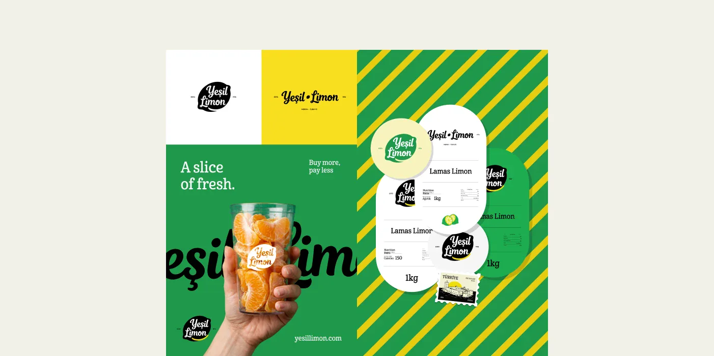
By renewing Yeşil Limon’s logo and corporate identity, we gave its natural, energetic character a stronger visual language. We then extended the system across the brand’s touchpoints, from packaging to the digital experience.
We created the brand’s new visual identity and logo system.
We are updating the product labels in line with the new brand identity.
We designed a brand-specific user experience and interface built for the Ticimax e-commerce platform.
From product discovery to checkout, we adapted the e-commerce experience to Yeşil Limon’s visual world.
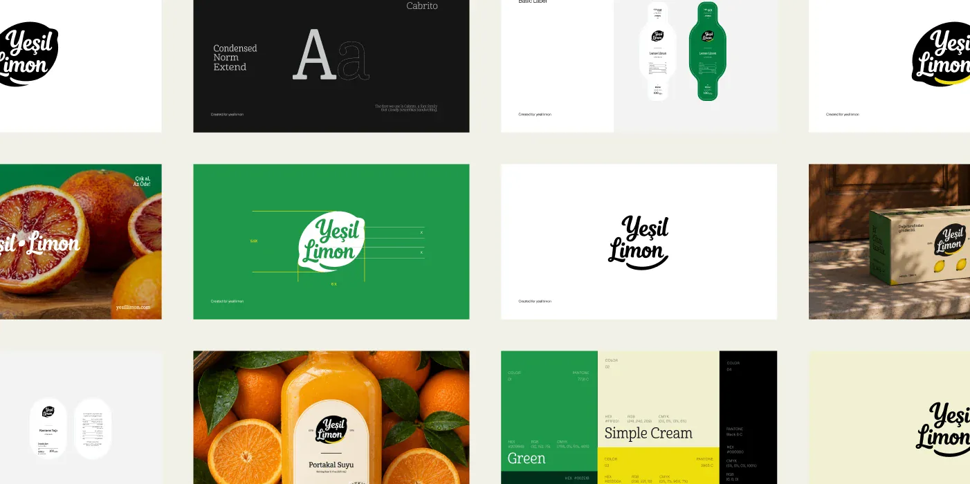
We turned typography, colours and graphic elements into a flexible system that works consistently from packaging to digital.
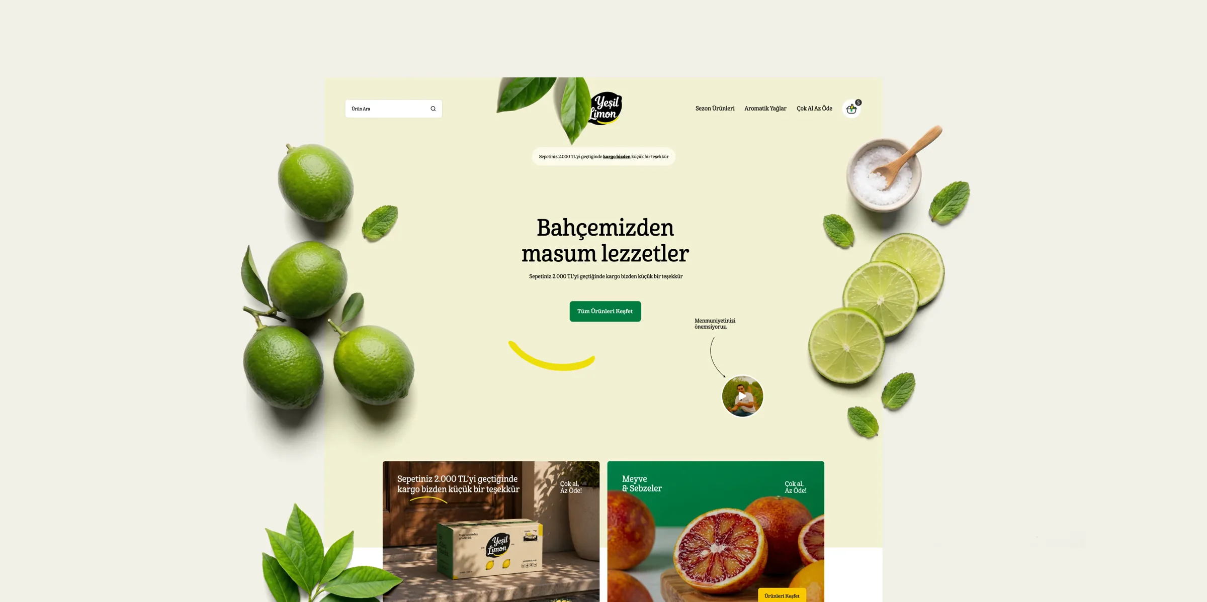
Carrying the brand identity into the e-commerce interface, we prepared an original design system that puts the products and their natural ingredients first. Technical integration was carried out by Ticimax.
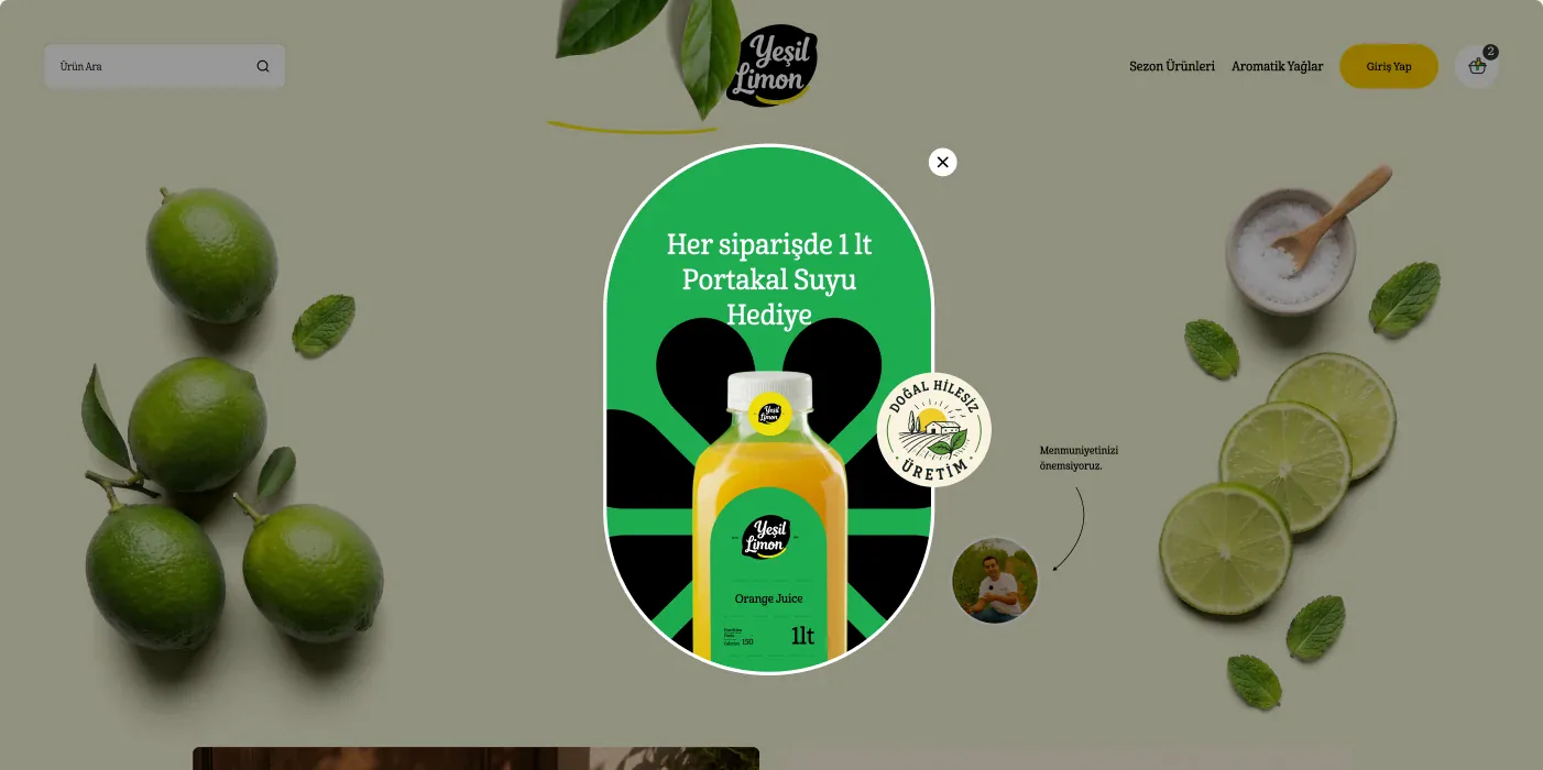
At Yeşil Limon, we wanted to channel the brand’s energy into a more consistent system. Bringing the logo, packaging and e-commerce interface into the same visual world gave the brand a much stronger, more recognisable character.