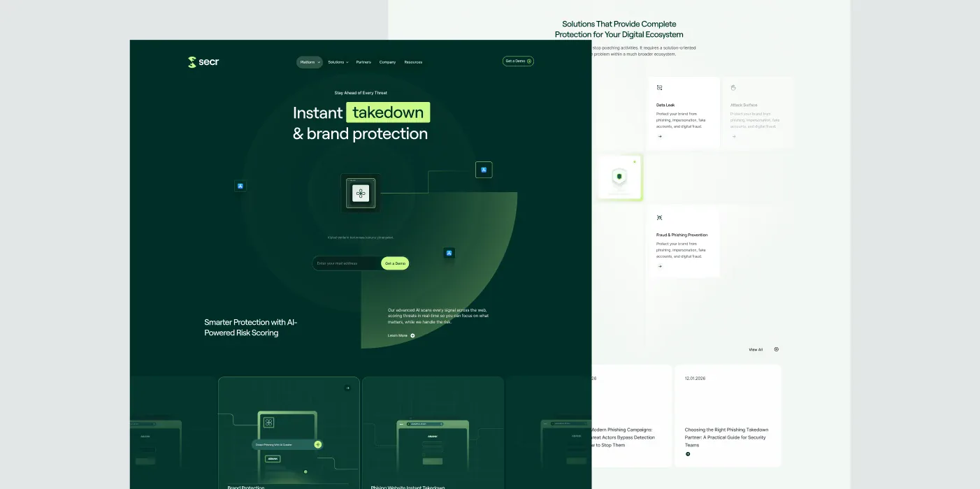
We turned the technology that scans for digital threats into the brand’s visual identity.
Scope: Brand Identity, Logo & Monogram, Visual System, Brand Guidelines
Format: 12” LP • 33⅓ RPM • Stereo
Made in Türkiye • ℗ & © Pikap Records 2026
What did we solve?
For SECR, we created a flexible brand identity that carries the technical character of the cybersecurity world and can live powerfully in digital products.
At the heart of the identity is an S monogram built from the brand’s initial. Its sequence of geometric segments draws on radar and scanning motion to symbolise SECR’s technology, which watches the digital world around the clock.
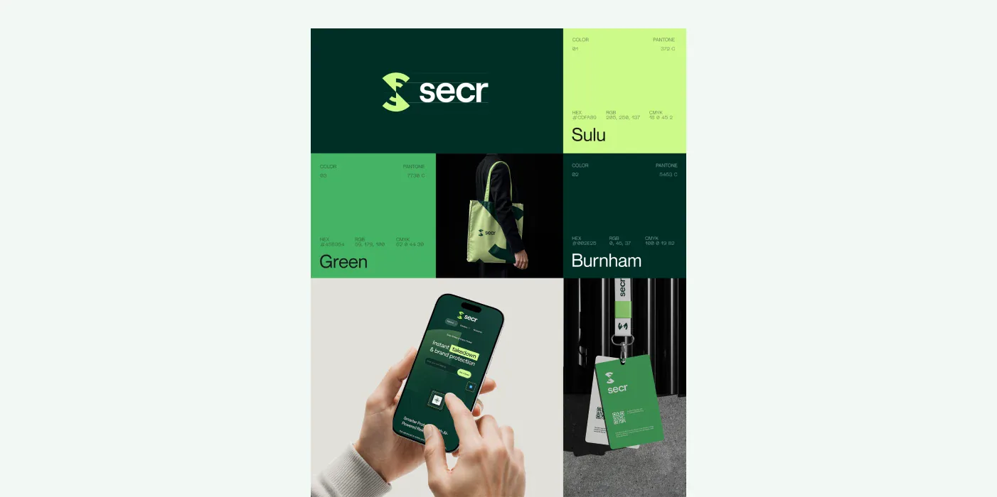
We created a cohesive brand identity covering the logo, monogram, colour, typography and core graphic system.
We combined SECR’s initial with the idea of scanning and radar to design the brand’s distinctive S monogram.
We turned forms derived from the monogram’s geometry into a visual system that works across different surfaces and compositions.
We prepared comprehensive usage standards so the identity is applied consistently across digital and physical touchpoints.
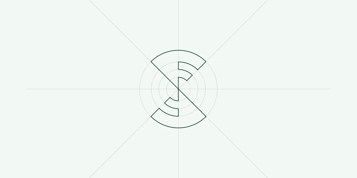
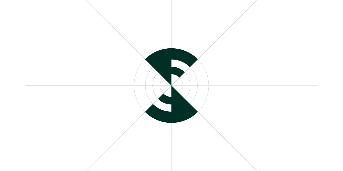
The geometry of the letter S became a symbol of technology that scans and locks onto its target.
We didn’t treat the monogram as a static mark. Its segmented geometry, moving around a centre, visualises SECR’s approach of scanning, detecting and acting on threats across the internet. This idea of motion later became the foundation of the brand’s digital experience.
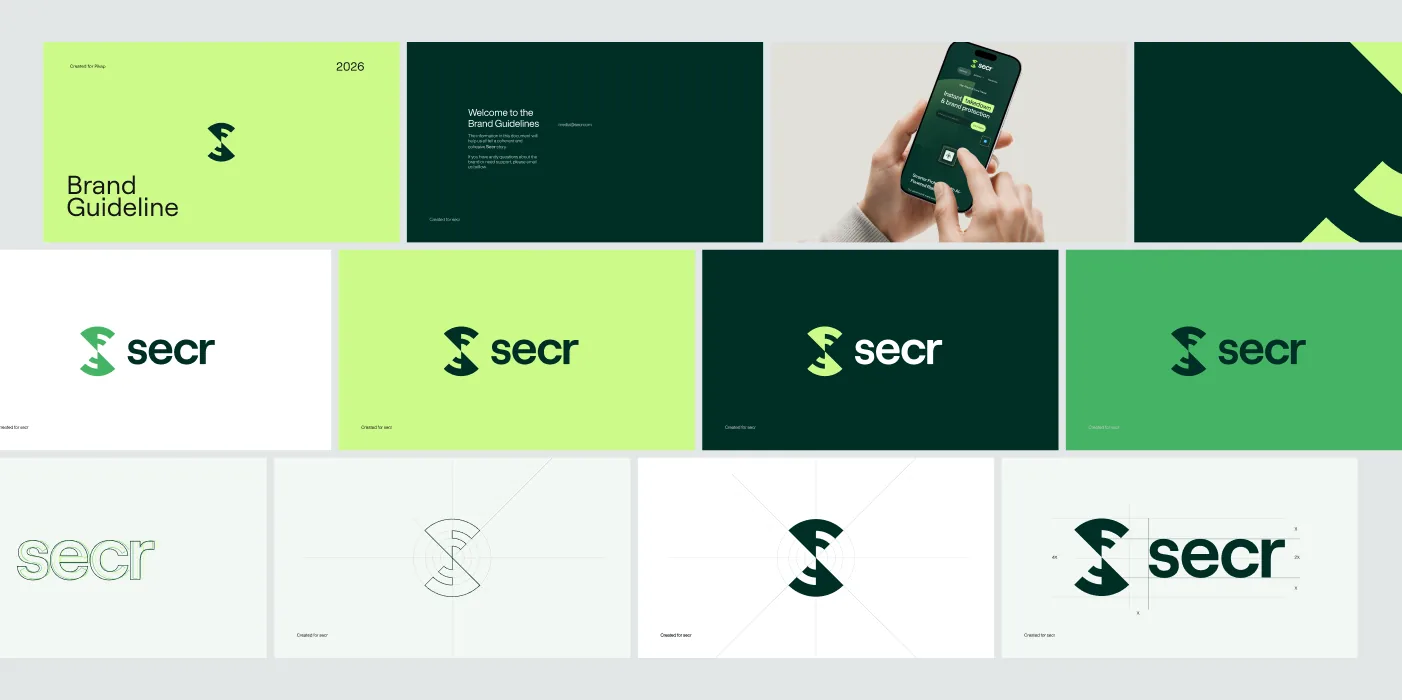
We created a sharp, energetic brand language built for high visibility in the digital world.
Pairing deep green backgrounds with high-energy green tones, we backed the focus on technology and security with strong contrast. Graphic elements derived from the monogram, typography and colour blocks form a consistent system that is instantly recognisable across applications.
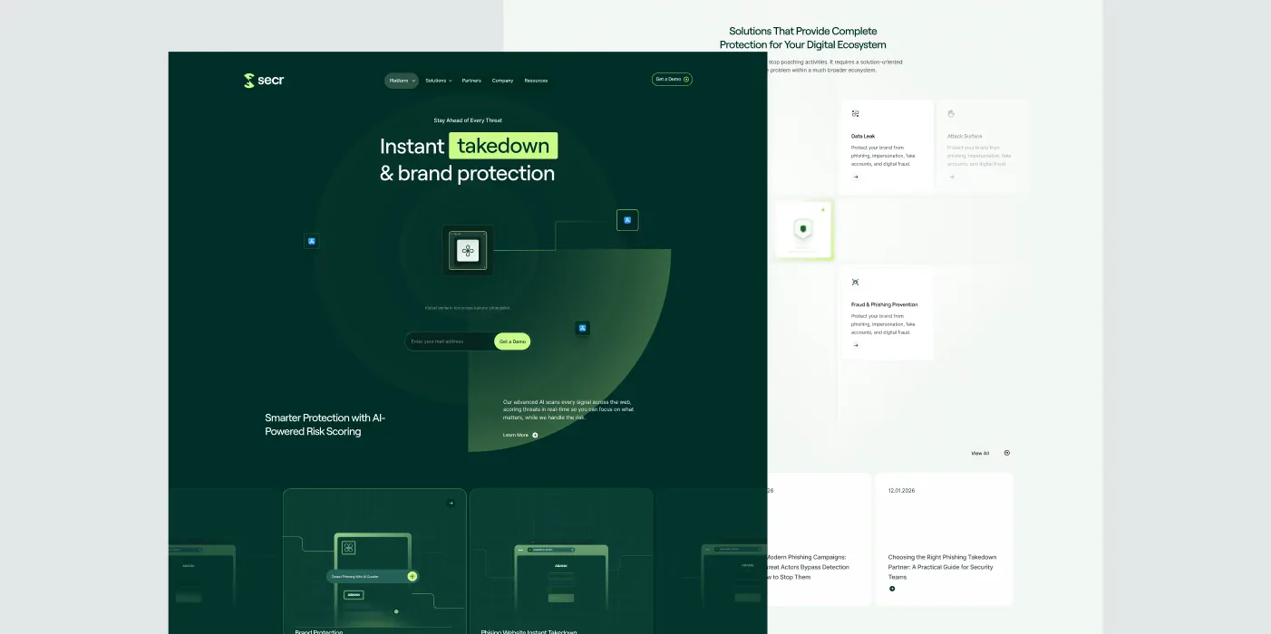
An identity designed to move also became the foundation of the web experience.
We designed SECR’s brand system with digital use in mind from day one. The monogram’s scanning idea carried over into animations, radar motion and interactions in the web interface, so branding and digital experience complete each other through the same visual idea.
With SECR, we wanted the logo to come out of what the product actually does. While working on the letter S, the scanning motion and radar geometry naturally met in a single form. That gave us more than an emblem: it gave us a brand language we could extend from colours and graphic surfaces all the way to the motion system on the website. Thinking about how the identity would move in digital while designing it was one of the strongest parts of the project.