We turned the trust of the insurance and reinsurance world into a contemporary, distinctive brand identity.
Scope: Brand Identity, Wordmark, Brand Guidelines, Presentation System
Format: 12” LP • 33⅓ RPM • Stereo
Made in Türkiye • ℗ & © Pikap Records 2026
What did we solve?
For Core Broker, we designed a contemporary brand identity that carries the institutional trust of the British insurance and reinsurance sector and works on an international scale.
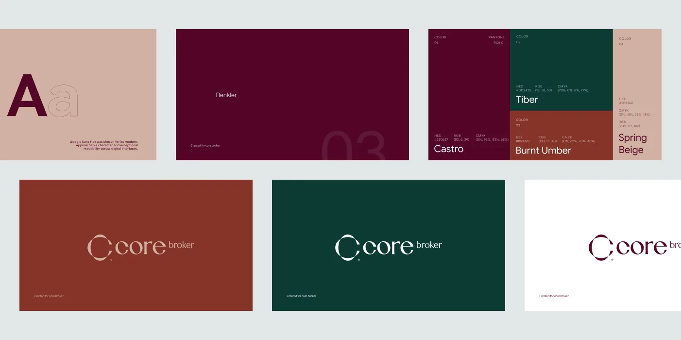
The identity started from a single ellipse. From that geometry we derived the emblem and the letterforms, building a visual system that belongs to the brand alone. Every drawing of the wordmark and emblem was made specifically for Core Broker.
We built the brand’s emblem, wordmark, colour and typography system under one cohesive identity.
We designed a wordmark unique to Core Broker, deriving its letterforms from the same geometric base as the emblem.
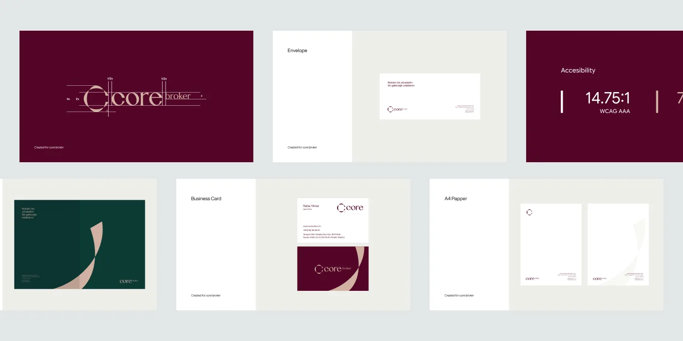
We prepared a clear, comprehensive usage system so the identity can be applied consistently across channels.
We created the core visual assets needed everywhere from corporate documents to digital applications.
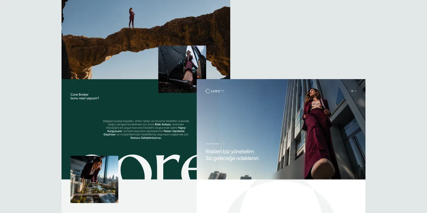
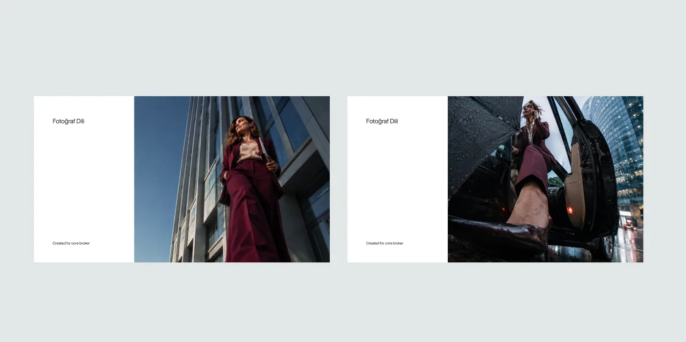
We created a cinematic photographic language focused on moments of trust, movement and decision.
Moving away from classic corporate business portraits, we chose wide, low camera angles that portray the character together with their surroundings. Close perspective, strong architectural lines and controlled depth of field put the person at the centre while bringing the scale and dynamism of the financial world into the frame.
Natural light, real locations and a deliberate relationship with the burgundy brand tone let the images work as an extension of the identity.
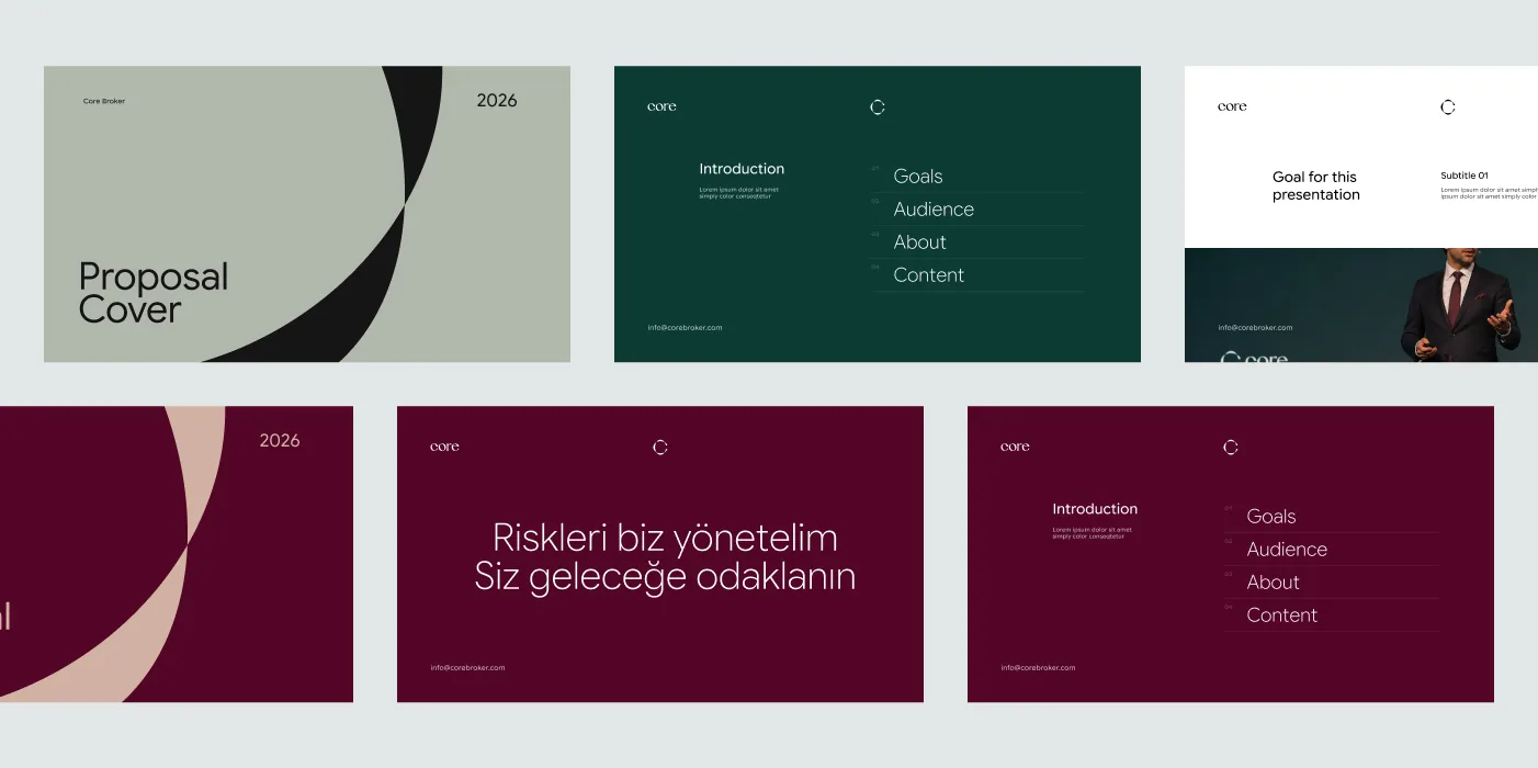
We built a scalable presentation system that brings the brand identity into everyday use.
We designed presentation templates with cover, section, text and data pages for different types of content, in a flexible structure that lets the Core Broker team produce new decks in-house while keeping the brand consistent.
What interested us most in the Core Broker identity was building the sense of trust the financial sector needs without leaning on clichéd corporate language. That is why the ellipse became such an important starting point. By carrying the same geometry from the emblem to the letters, and from graphic surfaces to presentations, we created the brand’s own visual grammar. In the photography, we set movement, perspective and a sense of real life against this controlled structure.