 Çağakan Bağcı
Head of Agency
Çağakan Bağcı
Head of Agency

Rebranding a company's face may sound simple. However, rebranding is positioned in the literature of many academics' approaches—from Aaker’s brand system approach to Keller’s memory-based brand model and Kapferer’s identity prism: it is a decision with high uncertainty and deep strategic significance. The reason for this is that brand identity is the totality of associations, experiences, successes, and emotions that have accumulated over years.
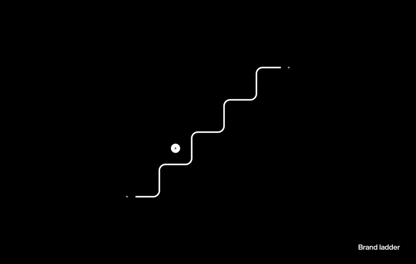
In this article, I share my thoughts that the rebrand process is not just about design; rather, strategy forms the foundation of this decision; how the brand’s memory, character, and future intentions are reflected in the visual language.
In the literature, brand identity is often defined as “memory structures.” For Aaker, this is the network of associations the brand has carried for years. For Keller, it is the image framework systematically stored in consumer minds. For Kapferer, it is the entirety of a cultural and behavioral identity prism. The rebrand decision, in essence, means touching this framework.
Changing a logo, color, typography, or rhetoric that has been used for years affects past investments, internal organizational habits, customer perceptions, and even the founder’s relationship with the brand identity. Refreshing a brand is about placing the past within a more refined framework. That’s why it’s difficult and why it’s not rushed.
Design is a result built upon strategy. In Kandinsky’s concept of “inner necessity,” Müller-Brockmann’s grid system, and Itten’s color theory, there is a common layer:
"Visual decisions have a contextual origin."
A color relates to the area where the brand is positioned. A typography is the voice of the brand. The grid system is the visual imprint of the brand’s way of thinking.
To explain this with a concrete example:
If a brand positions itself in an institutional, authoritative, and high-trust area; instead of a geometric and serif-free font, a more controlled, balanced, and weighty character should be used. The grid system accordingly becomes tight, repetitive, and discipline-focused. The spaces between elements, the composition of visuals, the hierarchy of headlines… all carry the brand’s mental architecture.
On the other hand, for younger, agile, and sincerity-focused brands, spaces become wider, typography softens, and the grid system breathes more. Visual rhythm accelerates. This example alone shows how strategy guides visual decisions.
When I started writing this, my aim was to explain how strategy guides design decisions in the rebrand process. However, as I progressed, I realized: understanding the impact of strategy on visual outputs only makes sense if we also touch on why the brand finds it difficult to make this decision. So I reoriented the article; I focused on the importance of rebrand, the difficulty of this decision, and how to find the right ground.
To put the complexity of this issue into a more practical framework, I gave an instruction (prompt) to artificial intelligence and asked it to generate questions the brand should ask itself.
The resulting list was as follows:
This set of questions is a good starting point. However, I can add from my own experience:
Where does the brand think it is positioned today, and where does it actually stand? Many rebrand processes begin with the alignment of these two points.
Each question also points to a broader discussion. The need for renewal often arises from a transformation in the business model, market competition, or entering a period where the brand no longer recognizes itself. The absence of a documented strategy drags the identity into emotional uncertainty. Elements preserved in the old identity ensure continuity of memory. If the team does not participate in this change, the identity cannot survive. Proper risk management turns rebranding into an evolution.
For a designer, rebranding is about understanding the brand’s inner world, emotional load, future expectations, and cultural memory. Design emerges when these layers are in place and exists to define a new era.
It may sound cliché, but I cannot resist saying:
A good rebrand does not erase the past; it organizes the past and provides the brand with a clearer window to the future.
No visual renewal that does not start with strategy can create the desired impact, no matter how impressive it appears. That’s why the starting point of every rebrand process is the same. First, we define the brand together through visual identity, and then, as a natural consequence, it follows.
In the formation of this text, I benefited from Aaker’s brand system approach, Kapferer’s identity prism, Keller’s memory-based brand model, and Itten’s and Hering’s color theory. Additionally, the strategic approach of my dear friend Berkay Daçe, with whom I have had the opportunity to work for years, enriched the conceptual framework of the article.
I used artificial intelligence to find sources, edit, and create in-text guiding frameworks; however, all decisions are based on experience, intuition, and real work with brands.
The mental framework that determines how a visual decision appears and why it should be that way. The fabric that forms the origin of design.
The network of associations a brand builds in the customer's mind over the years. The invisible layer of identity that operates deeper than the logo and color.
The holistic structure reflecting the brand's way of thinking, made up of decisions such as typography, grid, spacing, and composition. More than an aesthetic choice, a mental order.
The strategic address that defines how the brand is situated in the market relative to competitors, culture, and the target audience's mind.
The state of coherence where the brand's symbols, language, behavior, and promises support each other. Much more than visual harmony.
A rebrand approach that organizes rather than resets the existing identity, preserving the past and aligning with the future.
A focused session where brand decision-makers come together to uncover collective memory, sharpen future goals, and set the direction of the design process.
The emotional and behavioral response that the brand evokes in the target audience. The ultimate threshold that design aims to reach.
The arrangement that ensures the brand maintains the same character at every touchpoint by working together through color, typography, iconography, grid, and proportions.
The way the internal order, culture, and strategic approach of the brand are reflected in visual decisions. It becomes visible through grid, spacing, rhythm, and typography.